Experienced e-learning professionals agree that digital instructional content incorporates elements of art and design principles. It is just as much about visual and artistic interest to the learner, as it is about acquiring knowledge and skills. Combined with the consumable nature of online learning, it becomes vital for instructional designers (ID) to always consider the aesthetic appeal of courses.
This article will break down the universal elements of art and principles of design that can serve as guidelines to elevate instructional strategy.
Elements of Art
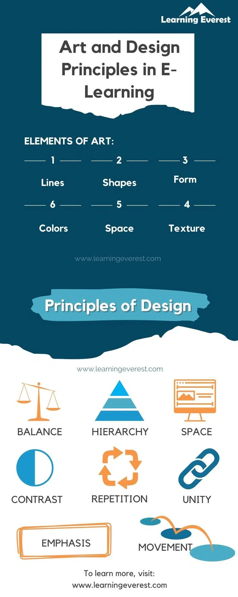
Here, “art” strictly refers to visual art. All visual art is a collection of a few elements that experts have agreed upon for centuries. These elements are lines, shapes, forms, colors, textures, and space.
Even a little child’s drawing will consist of one, a few, or all these elements. Skilled designers and artists know how to manipulate these components to create impact, interest, and appeal.
1. Lines
Lines are strokes that connect two or more points in the visual field. They can create emphasis, direct the eye, divide spaces, and add or subtract structure.
Lines can have multiple characteristics, despite being the most basic component of visual content. Some examples of lines are:
- Continuous lines
- Dotted lines
- Dashed lines
- Straight lines
- Curved lines
- Zigzag lines
- “Squiggles”
Additionally, lines vary in weight, texture, and angles. Thus, lines lend flexibility and can easily help set the mood and tone of a course.
2. Shapes
Shapes are enclosed collections of 2D lines. We are all aware of basic shapes like squares, triangles, rectangles, and circles. However, just about any figure with enclosed boundaries made of lines counts as a shape. Designers categorize shapes as mechanical, organic, and abstract.
- Mechanical shapes are angular and geometric. (for e.g., a square)
- Organic shapes mimic natural objects. These shapes tend to be softer and rounder. (for e.g. a raindrop)
- Abstract shapes have irregular boundaries and don’t particularly represent or resemble anything. They’re open to interpretation and mostly used for visual interest rather than symbolic imagery.
When analyzed, all complex visual elements can be broken down into a collection of various shapes. For instance, a human body can be deconstructed into circles, cylinders, trapeziums, ovals, etc.
Thus, the use of shapes includes stylistic, as well as functional purposes. They can combine to form rich illustrations, become a part of the interface (such as a triangle for a play button), or serve as text boxes, among other things.
3. Form
Form refers to objects that have three dimensions and occupy space. It can be thought of as the 3D counterpart of shapes or complex figures.
The following characteristics constitute form:
- Length
- Width
- Height
- Volume
Just like shapes, forms can also be geometric, organic, and abstract. They add dimensionality to the visual field to break the monotony and can express relationships between the elements on the screen.
For e.g., a square is a shape, but a cube is a form.
4. Colors
We all know what color is. From a visual design perspective, color is used to set moods and influence behavior. In fact, an entire area of study – color psychology – is dedicated to understanding the subliminal and cultural messages associated with different colors.
Colors have three components:
- Hue – this is where a color lies on the color spectrum, the color family it belongs to, so to speak
- Saturation – higher saturation produces a more intense color, lower saturation makes the color milder or even dull
- Values – refers to how much light a color has absorbed. Values create contrast, depth, and harmony.
Colors are often combined into palettes or “color schemes”. They make visual media more attractive by applying color theory. Color schemes can be contrasting, analogous, or monochrome. Limiting content to a few colors makes it coherent and adds continuity.
5. Space
Spaces are blank areas in the visual field that surround the other elements and form the background. Space is also referred to as “white space’ or “negative space”. That is not to say that space is always white, the term is more of an expression of the blankness of white space.
Spaces help with visual organization and hierarchy. Too little space is overwhelming and too much space might fail to hold a learner’s attention. The principles of design that we will discuss a little later in this article mostly revolve around space.
6. Textures
While texture is a tactile sensation, visual design can mimic or imply it to create unique effects for the eye. By combining the elements mentioned thus far, you can produce multiple textures.
For example, expressing light and shadows using cross hatches that gradually become sparser.
Principles of Design
Let us now look at how to use the elements of art effectively by applying the principles of design to them.
There are 12 principles of design in total. Out of these, the ones that most commonly appear in e-learning content are mentioned below.
1. Balance
This principle refers to equal distribution of weight or visual symmetry between elements. Borders, harmonious colors, sections, tables, etc. can be great ways to create balance. Navigation buttons can often be great tools to establish balance since they have backward and forward triggers that can be placed on one end of each screen.
2. Contrast
Contrast refers to difference in qualities of different elements. Contrasts serve to distinguish the figure from the background and guides the eye to the most important objects on a page. Using complementary colors, light and dark values, shadows and light, etc. can enhance contrast. The general rule of thumb is to establish opposition between elements.
3. Emphasis
Emphasis is similar to contrast in that it is used to draw attention, however, opposite elements, characteristics, and qualities are not the weapon of choice. Instead, the approach is to highlight specific elements. An example is to add a pulsating effect to an image on screen so the eye is drawn to it.
4. Hierarchy
Hierarchy is using visual cues to highlight the relative importance of visual elements on a screen. Usually the size of elements are in direct proportion to how important they are. Thus, something like using a big font size and emboldened letters for the page title instantly forms a visual hierarchy.
5. Repetition and patterns
Repetition and patterns add uniformity and can also reinforce information that is important. Usually, the two principles are regarded as separate but they more or less have similar ends and means. Often, repetition is added via navigation buttons, interface design, templates for specific treatments, header images, bullets, icons, etc. Repetition makes the learning experience consistent and predictable.
6. Movement
Movement grabs attention and adds visual interest. It disrupts monotony, as well as gives the learner experience some life. Pop-ups and drop-downs are great interactive ways to add movement. Additionally, illustrations and graphics with animations can serve the purpose, too. A more on the nose way to add movement is adding videos. However, the effect of movement can also be achieved just by using lines strategically, such as diagonally or adding arrows and angles to the course.
7. White space
Space, as discussed above, aids in visual organization and adds texture to the learning.
8. Unity
Unity refers to using elements in such a way that they all have clear visual relationships with each other. Using the seen principles with consistency and at relevant junctions usually does the trick. Additionally, the course’s content should also tie into one topic or concept to promote unity. Lastly, abbreviations, metaphors, character names, etc. should all remain consistent.
Conclusion
Art and design is not only limited to typically creative endeavors, but also has important implications for e-learning design. By improving learner experience through design thinking, digital learning can become a dynamic and memorable experience for the learner, fostering better retention and enhanced learning outcomes.
Infographics

Elements of art and Principles of design
Frequently Asked Questions (FAQs)
What are the 5 basic elements of art?
The 5 basic elements of art are:
- Lines
- Shapes
- Colors
- Form
- Textures
Why are the elements of art important in e-learning?
The elements of art help make visually appealing and visually organized course that are easy for the learner to digest.
What are the 5 main design principles?
The 5 main design principles are:
- Balance
- Contrast
- Repetition
- Hierarchy
- Unity
Why is design important in e-learning?
Thoughtful and intentional design improvers learner experience and makes e-learning dynamic and memorable. Good design also leads to higher engagement.


